

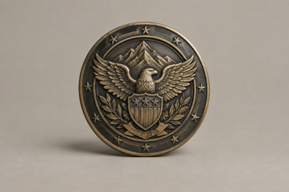
A meaningful recognition award does more than mark an occasion. It gives the recipient a physical reminder of the work, service, or leadership that mattered. For organizations seeking a detailed, lasting format, 3D challenge coins can turn a story into a sculpted keepsake with raised details and visual depth. Challenge Coin Country is a Texas-based custom recognition provider with more than 15 years of industry experience, offering design proofs and custom sculpted coin options for groups across the United States.
The most effective awards are not necessarily the largest or most expensive. They are specific. A well-considered item can connect an emergency response team to a difficult call, a volunteer to a community project, or a project group to a successful launch. When the symbol, wording, material, and presentation support the same message, the award feels earned rather than routine.
Why Meaning Matters More Than Size
Recognition works best when it reinforces what an organization values. An award for courage should look and sound different from one for long service, collaboration, or technical achievement. The goal is to help people understand not only that their effort was noticed, but also why it mattered to others.
For example, an emergency response team that helped restore services after a major storm might receive an award featuring the local area, a utility symbol, and the date of the response. Those details make the piece a record of a shared accomplishment, not simply another generic plaque.
Start With The Achievement, Not The Object
Before choosing a shape, finish, or material, define the action being recognized. Separate major milestones from everyday contributions, leadership, teamwork, innovation, service, and acts of courage. This prevents the design from becoming a collection of decorative ideas without a clear purpose.
- What action deserves recognition?
- Who benefited from that action?
- What symbol best represents the result?
These questions also support a stronger culture of recognition. The basic idea behind employee recognition is to acknowledge contributions in a way that connects people with their work and organization. Specific criteria make that connection easier to understand.
Turn A Story Into A Visual Symbol
Symbols make an award easier to remember. A fire apparatus, building silhouette, map outline, service emblem, mascot, tool, aircraft, or project image may all work when they have a genuine connection to the achievement. Choose one main visual, then use only two or three supporting details, such as a date, motto, or small insignia.
Avoid trying to include every department logo, phrase, and historical reference. Too many competing elements make the main story harder to see. If an idea cannot be understood at a glance, simplify it before moving into production.
Choose Details That Support The Message
Shape, relief, color, texture, lettering, and finish should guide the eye toward the most important detail. Small awards need especially careful editing because very fine lines and tiny letters can be difficult to read at the finished size. Review the concept first in black and white. If the hierarchy is clear without color, color can enhance it rather than rescue it.
- Is the main symbol easy to recognize?
- Can the wording be read without magnification?
- Does the design fit the occasion and recipient?
- Will it still look appropriate after years of display?
Write A Message That Feels Specific
“Outstanding Performance” may be accurate, but it does not explain what happened. Better wording identifies the recipient, names the accomplishment, and states the impact. Keep the message brief enough to remain readable, especially on a smaller item.
Recognized For: [Specific Action] + [Result] + [Date or Event]
- Nonprofit volunteer: “In recognition of 250 hours supporting neighborhood food access, 2026.”
- Public safety team: “For coordinated flood response and community rescue operations, April 2026.”
- Military unit: “For mission readiness, disciplined service, and unit excellence.”
- Corporate project group: “For delivering the client transition ahead of schedule, 2026.”
Select A Material And Finish With Purpose
Finishes affect both appearance and readability. A polished finish reflects light and can create a formal look. Satin finishes are softer and more subdued. Antique finishes darken recessed areas, which can improve contrast in detailed relief. Two-tone designs can separate a focal symbol from a surrounding border when used sparingly.
Choose the finish after the central design is settled. A bold metal tone may be right for a ceremonial presentation, while an antique finish can suit a commemorative piece with textured or sculpted details. The finish should strengthen the visual story, not become the story.
Use Tactile Design To Make The Award Memorable
Depth and texture invite the recipient to look more closely. Raised lettering, dimensional portraits, patterned backgrounds, and layered surfaces create shadows and physical variation that a flat design cannot provide. These features are especially useful when the award represents equipment, architecture, wildlife, landscapes, or service insignia.
Tactile design also gives a small recognition item greater presence. A recipient can feel the edge, relief, and engraved areas while holding it, which helps make the object feel personal and intentional.
Plan For The Recipient And The Setting
Match the item to how it will be presented and used. A formal ceremony may call for a larger display piece, a presentation box, and a short statement describing the achievement. A small team meeting may be better suited to a portable keepsake that can be carried, displayed on a desk, or added to a personal collection.
For recurring programs, ask whether recipients are likely to display, wear, carry, or store the award. That answer can guide size, weight, attachment options, packaging, and the amount of text included.
Build A Fair Recognition Process
Strong design cannot correct unclear criteria. Write down what each award recognizes, who may nominate recipients, and how decisions are made. Include individual and team categories where appropriate, and review the program regularly to ensure that different roles and departments have a fair chance of being recognized.
Review The Design Before Production
- Check every name, title, date, and department or unit detail.
- Review the artwork at its actual production size.
- Confirm that small lettering and fine lines remain visible.
- Ask someone unfamiliar with the project what they notice first.
- Approve a final proof before production begins.
Common Mistakes To Avoid
- Using a generic symbol unrelated to the achievement.
- Adding more text than the available space can support.
- Copying a logo without adapting it for the award’s shape.
- Selecting a finish before deciding what the design needs.
- Making every award identical even when the achievements differ.
- Leaving too little time for artwork review, production, and delivery.
A Simple 2026 Design Workflow
- Define the purpose and the achievement being honored.
- Gather names, dates, symbols, visual references, and milestones.
- Create one focused concept with a clear main image.
- Test readability at the final size.
- Select finishes, colors, and textures that support the concept.
- Let stakeholders closest to the achievement review the proof.
- Present the award with an explanation of why it was earned.
Conclusion: Make The Award Tell The Story
Meaningful recognition begins with a real story. When the achievement, imagery, wording, material, and presentation all work together, the award becomes more than a keepsake. It becomes a reminder of service, progress, teamwork, and personal effort that deserves to be remembered.
